The commission
Pre-press production – editing, typesetting, proofreading, jacket design, indexing
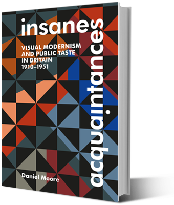
Comment
This jacket illustrates how good designers immerse themselves in a book’s message and milieu. Rejecting the image originally supplied with the manuscript, the designer chose an abstract design based on the contemporary artistic styles referenced in the text; he also chose relevant fonts, Futura and Gill Sans. This cultural knowledge and sensitivity notwithstanding, a keen practical eye led him to make the backdrop black instead of white so that the book title is clearly legible.


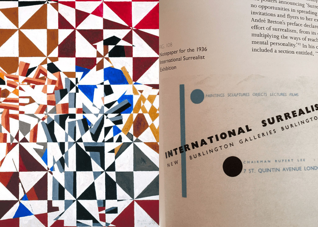
Below: Artwork by the avant-garde artist David Bomberg (left) and Surrealist exhibition notepaper (right), used by the jacket designer as relevant contemporary sources for the book cover design.